7 Key Message Examples to Inspire Your Marketing
Many SaaS companies and founders get caught up in the “If you build it they will come” mythology. But just because your product is there doesn’t mean people will understand or care about it. Yes, you need a marketing strategy, but more than that, you need strategic talking points.
That’s how we arrive at key messaging.
What is key messaging?
A key message is a specific idea you want your audience to understand and remember. It also explains the value and/or service you provide. It’s a one- to two-sentence marketing message that addresses the pain points your customers face and identifies how your product or service solves them. Here’s an example from Dealhub:
Streamline your quote-to-revenue process. Issue proposals, close deals, manage contracts, and automate your subscriptions and billing in one unified platform.
We can infer the main poin point is that quote-to-revenue process is uneven and disjointed across platforms.
Key marketing messages should be at the heart of all written and spoken communications. And while a key message is not itself a brand message or brand promise, it should closely align with both.
The key message formula
You need a sticky message that tells your potential clients everything they need to know quickly: no long explanations, no feature lists, and absolutely no jargon.
Developing a message isn’t easy, but we have a framework that simplifies writing them:
[Value] by [how] with [capabilities].
Here’s how Dealhub’s message above breaks down:
Value: Streamline your quote-to-revenue process [I personally would have chosen something more concrete, like “Turn your quotes into money faster.”]
How: With a unified platform
Capabilities: That lets you issue proposals, close deals, manage contracts, etc.
Ideally, you’ll create multiple versions of your key message tailored to each of your buyer personas. Today, we’ll focus on overarching key messages from real-life brands.
What is a good key message?
An effective key message is:
Concise. We’re talking 1-2 sentences with a maximum of three commas
Compelling. Your audience should want to learn more after reading your message
Relevant. This information is need-to-know and is not the place to try to stuff everything you want to say
Focused on value
Here are some questions I ask myself when evaluating key messages like those below:
Do I understand, even generally, what this company does?
Does the copy make me want to learn more?
Is the writing clear and concise?
Does the message convey the value of the product?
A brief word on value
Many teams struggle to pinpoint the value of their product. A checklist of features is not value. “Repository of open-source code” is a product description that does not convey value. A description of value would be something like, “Collaborate seamlessly with your development team to improve your code.”
Value: Improve your code
How: Seamless collaboration
Capabilities: Open-source code repository (implied)
To create a strong core message, you must market on value.
And now, on to the examples! This post was first published in March 2022. Since then, some companies have updated their home pages. My analysis will address the changes and the original messaging.
PS: If you like examples with breakdowns, check out examples of really bad real-life messaging and examples of fantastic hero copy.
Strategic key messaging examples
Microsoft Azure
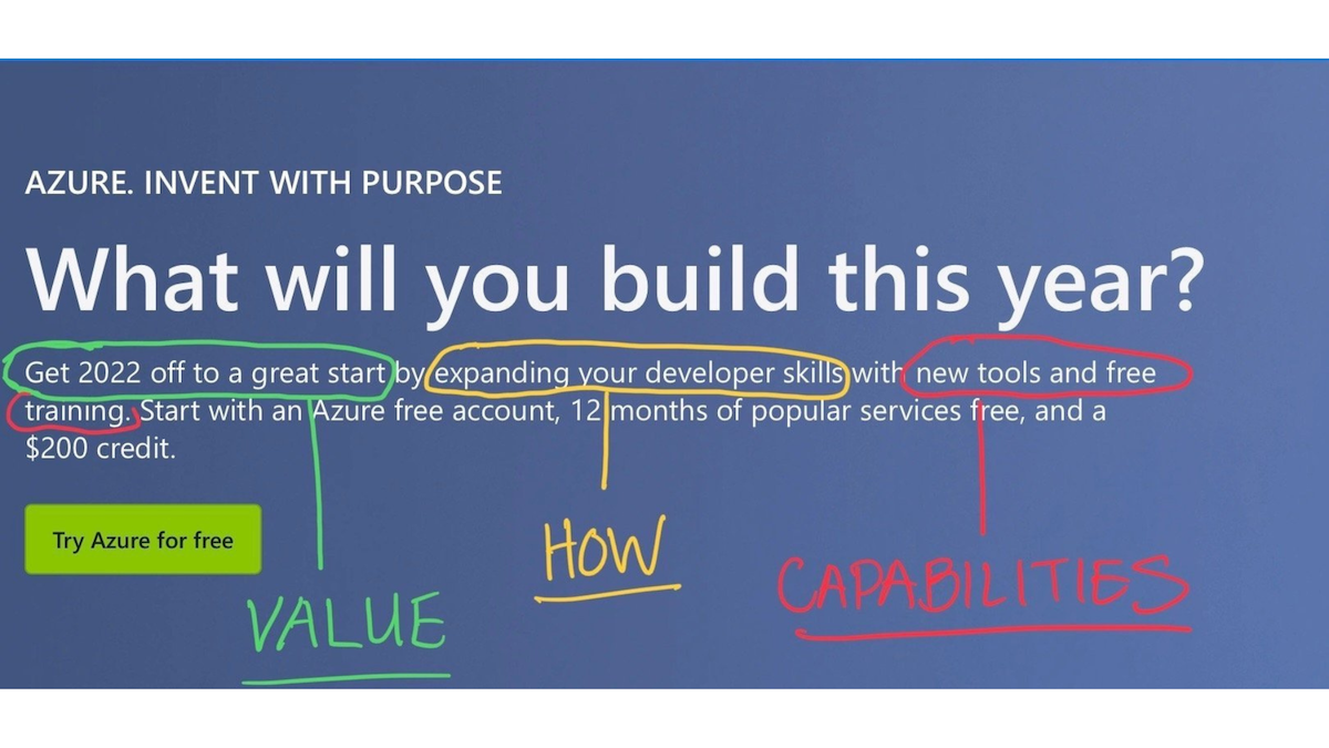
Azure’s marketing might be boring to some, but their March 2022 homepage hero section is one of the best key message examples out there. They lined up every component of a key message without any fancy footwork. The messages were simple and clear, qualities that are very difficult to achieve when describing technical services.
This savvy message led directly to their call to action—try Azure for free. You know what you get and the value it brings you, so why not try?
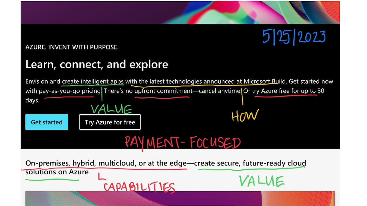
The May 2023 update is a little less crisp. “Learn, connect, explore” feels more centered on innovation and discovery, but there’s no clarity as to how Azure enables that or what it actually means. The value we get is to “create intelligent apps,” but, again, there is no indication as to what those apps are or why we need them.
In the white section below, we get a bit more of the clarity that’s missing above, about creating secure, future-ready cloud solutions. I wonder why that’s not bigger and higher up?
Interestingly, their current messaging is very focused on payment. Clearly, their primary goal is to increase conversions to a free trial, but they aren’t doing it in a value-driven way. It seems Azure drove a 17% increase in cloud solutions revenue in Q1 2023, so the purchase-driven copy must be performing well.
For funsies, I used the Wayback Machine to look at what they messaged in March 2023. The same pricing message was there, but their bigger message focused on harnessing AI. Frankly, I love that they iterate (and presumably test) their homepage copy.
My advice: Use the 2022 version as a template for a solid key message, and remember that Azure is one of the big boys. They are well-known, established, and able to market at a different level than largely-unknown startups.
Bonus video: Dealhub
DealHub knows its message of “maximizing revenue,” but that’s a very universal, non-specific message. How can they make it stick? Build stronger headlines using some of the fantastic body copy they have.
More on my TikTok: @thisisellisf
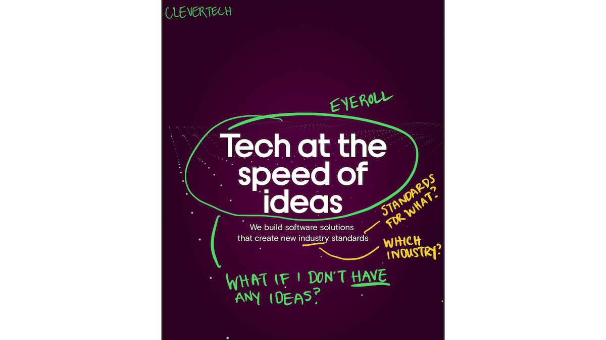
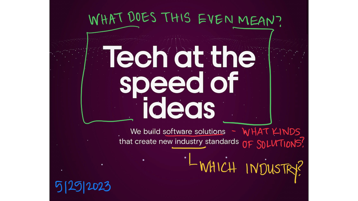
Clevertech did not change its homepage at all at the other end of the spectrum. The message is an example of fancy footwork that ultimately means nothing. What is Clevertech selling? What kinds of solutions? What do they do, and for whom?
Nothing in this copy tells us about their target audience, the pain points that audience might experience, nor how Clevertech solves those pains. Essentially, they have no message. Don’t do that! At the very least, get some of my free advice. Friends don’t let friends market poorly!
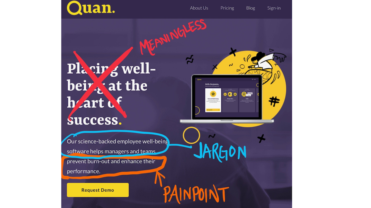
Quan is a great example of a company that elevated its messaging. Their 2022 hero copy was an example of why we want to avoid buzzwords like “well-being” in key messaging—buzzwords tell us nothing.
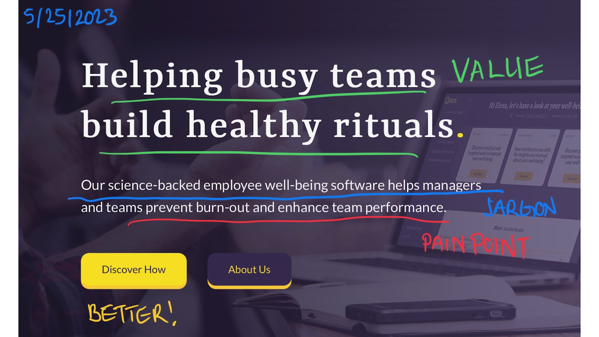
The updated headline is much stronger and more evocative. It tells us what they do and demonstrates the strong value of “healthy rituals.”
Their subtitle copy has remained the same, and I still believe that the first phrase about “science-backed employee well-being software” is jargon-y and unclear. Backed by science how? Why does it need the backing of science? What were the results? What is well-being software? But the second part uses clear pain points that support the value in the headline.
As an aside, I like that they changed their button to “Discover How.” It is much better than “Request a Demo,” though I’m not so sure about the “About Us” button. I’d rely on data to determine whether it’s worth retaining.
Bloss
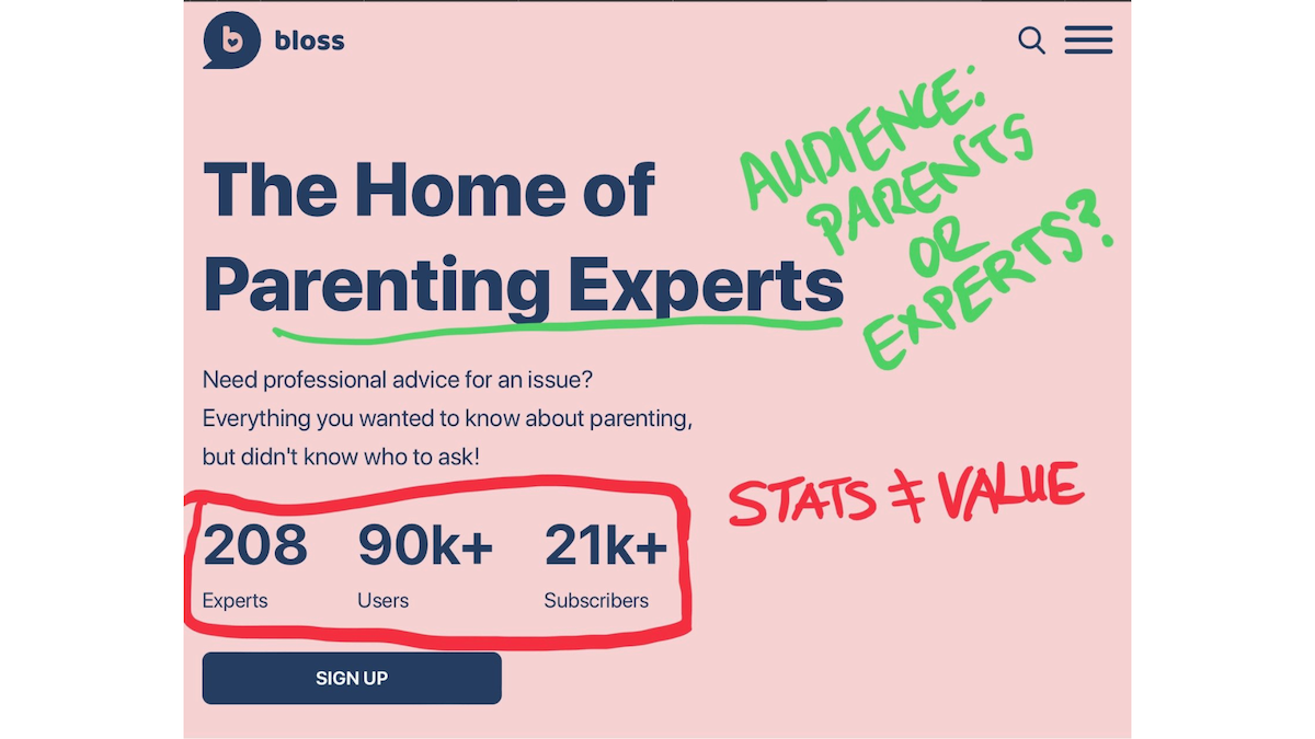
Bloss’ 2022 subhead did a decent job setting up a unique value proposition, even if it was a bit limp. Their headline missed a chance to grab attention, and their target audience was murky. Are they recruiting parenting experts to join forces, or are they targeting parents who need help?
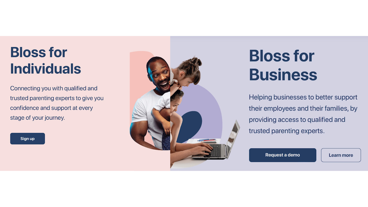
Clearly, they also realized this because their hero now offers a path for individuals and businesses. I’ve had experience marketing to distinct personas with different buying methods, and it’s tricky. I think this is the most elegant current solution for Bloss.
The copy itself though doesn’t address pain points. Do parents need “confidence and support,” or do they need expert advice about things like sleep, health, nutrition, etc.? It’s not clear what their trusted parenting experts provide.
The “For Business” side works a bit better. Bloss doesn’t need to be as specific because businesses want to provide support and benefits that retain their employees or attract new ones.
To really drive home their message, Bloss should get more specific with the support they offer. Is it for any parent, or just for parents with kids under or over a certain age? Do they provide medical advice or are they more of an assistance hotline that connects them with the correct services?
You’ll notice they eliminated statistics from the hero. I love proof points, but the originals were more app statistics than proof points, so the removal was wise. I would love to see them put quality testimonials up top to drive home their value.
AllSpice
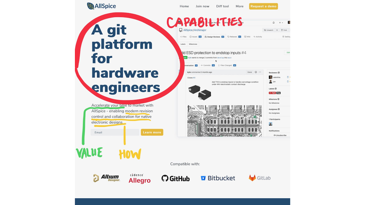
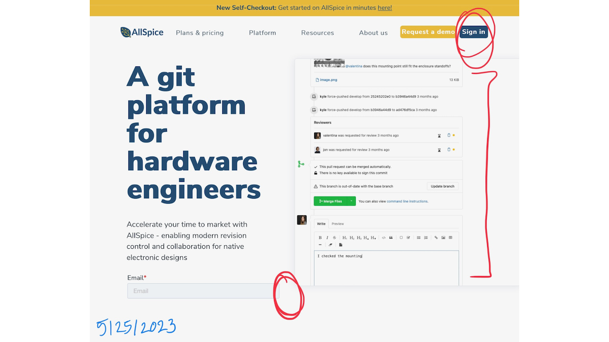
Here’s another company that did not update their messaging, but in this case, I think that’s fine because they bring their key messaging A game. All three components of the key message formula are clearly stated and they use their top-of-page real estate strategically. We know what they do, the value they provide, and how they do it.
They could easily switch the how and capabilities annotations, but either way, they tell us the most important things we need to know so we’ll understand and remember what they do.
The most interesting thing to note is that they eliminated the “Learn more” call to action button from the email field when I took this screenshot on my iPad, but on a desktop, the button is there. They also changed up their image, and while product screenshots are very important, the current one might be a little less eye-catching.
Phantom
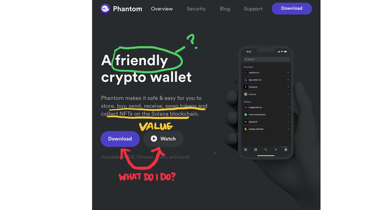
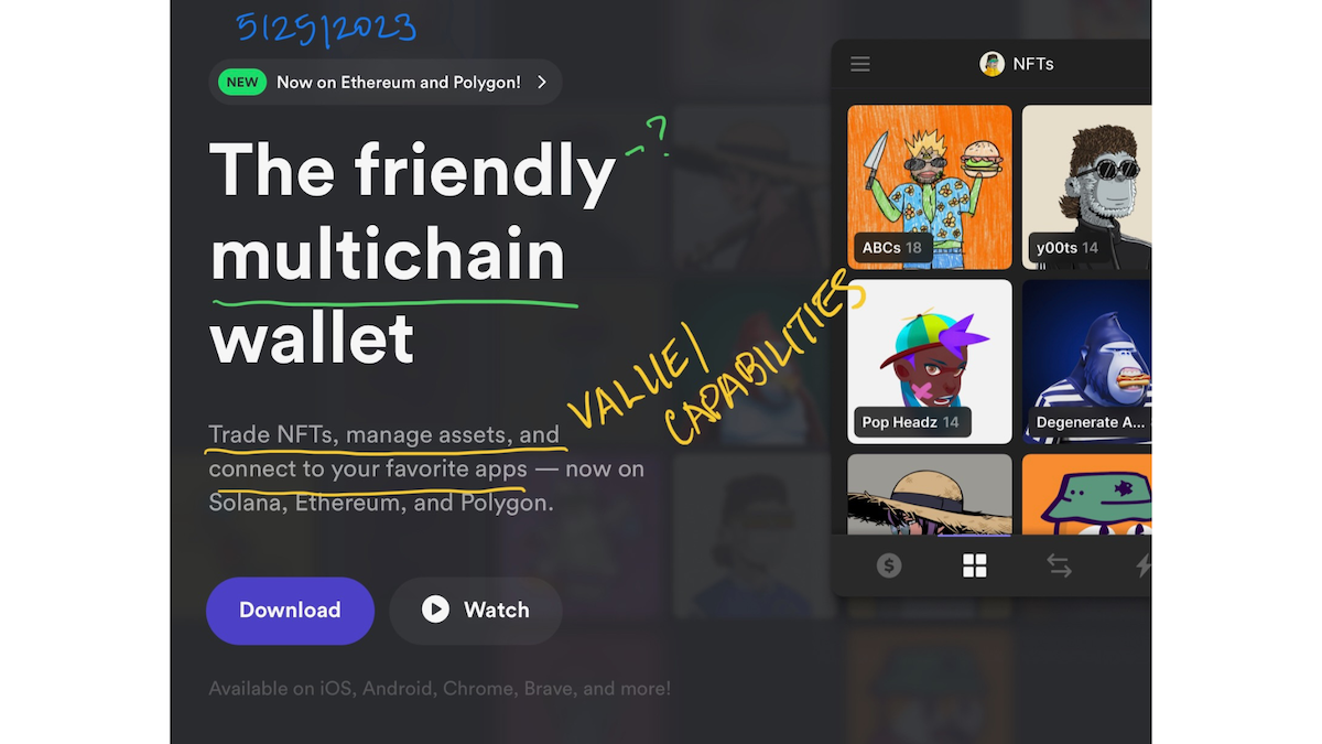
Phantom’s 2022 messaging was middle of the road, and it’s much the same in 2023. They say what they are; last year it was a crypto wallet, and now it’s a multichain wallet. But they’re still using the “friendly” language, and I’m still asking, what is a “friendly” wallet?
They’ve also seemingly removed crypto from their marketing, even though they connect to crypto apps like Ethereum. Overall, it feels like their above-the-fold messaging assumes we already know what they do and doesn’t go out of its way to build an emotional connection.
To create a complete key message, Phantom could have focused on the shortcomings of non-friendly wallets and demonstrated how they solve the problems of their target market.
Decipad
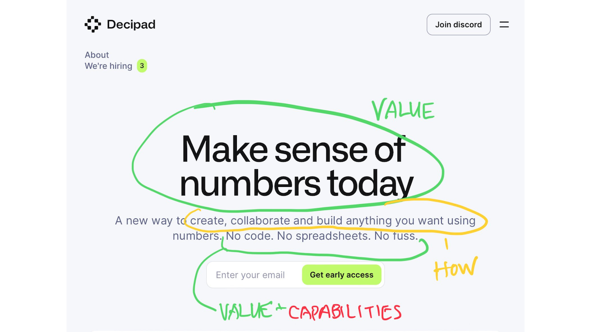
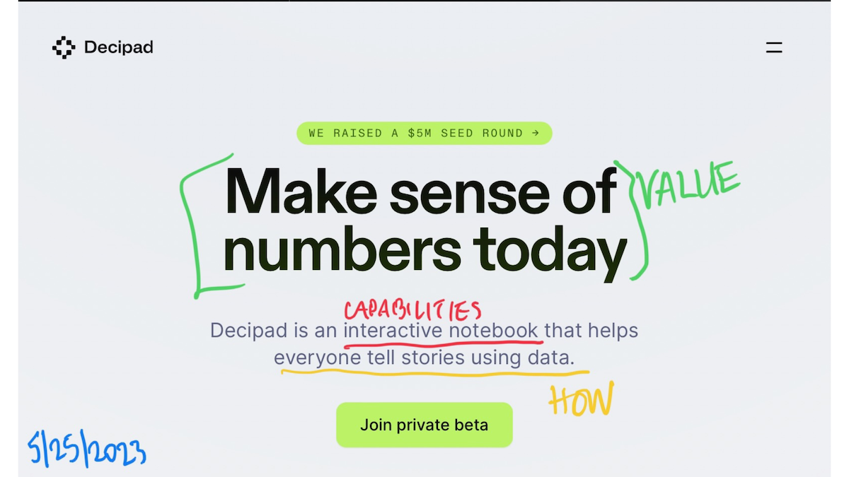
Decipad is a solid hitter. They go heavy on value and don’t get in the weeds with features, and I am here for it. The 2022 version painted a clear picture of the audience’s pain: They need to make sense of data, but they don’t want—or don’t know how —to make a big production out of it.
In 2023, they’ve kept the same snappy headline. It’s so crisp because it evokes both the pain (numbers aren’t making sense) and the capabilities (the numbers can make sense—today). Their subtitle has gotten a bit more vague. If you already know what an “interactive notebook” is, you’re way ahead of the game. But, do they only want to attract people who know what that is, or do they want to capture an audience that might want that same thing just described more clearly?
Decipad has also broadened its audience. While they didn’t specify anyone in 2022, now they say “everyone.” Really? Everyone? And what kind of stories can everyone tell? It’s just too vague. The previous iteration was much more specific.
How to create key messages
Creating a marketing message that is powerful and effective is a purposeful process. You probably won’t come up with good messages when you’re making instinctual or time-sensitive decisions. The creation process should involve multiple people from your organization and methodical brainstorming. Here’s what you must know when developing your messages and crafting a core messaging document:
The pain points your target market experiences
What the actual people in your target market care about
How your features bring those people value
We’ve led dozens of clients through a key message workshop to help them refine their understanding of pain points and create an effective messaging strategy. If you’re strapped for time and/or want to do it yourself, we did put our workshop into a DIY course you can use to lead yourself and your teams through a workshop on your own timeline.


